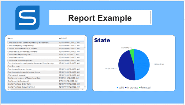
Report Example within Power BI
Load Data
First load data into a blank file.
- Open Power BI Desktop. (The web application is not able to import data from an SQL Server.)
- Select Import data from SQL Server to add data to your report.
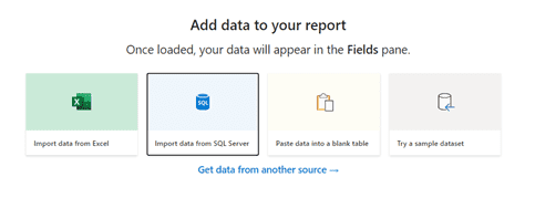
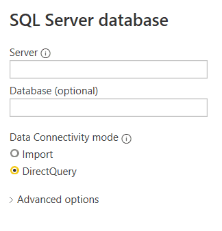
Enter the Server name and the name of the database. You can find this information in the email with your access data. Then select DirectQuery and click OK.
Connection Mode DirectQuery: Creates a direct connection to the database. The data is always up to date because it comes directly from the source and is not a copy. If the data in the original source is changing also the used data is changing. Import: Stores the data from the source to the Power BI file. The used data gets old because it's only a copy of the original data. This mode can be faster in performance, but is not recommended to be used for a report due to the huge file size.
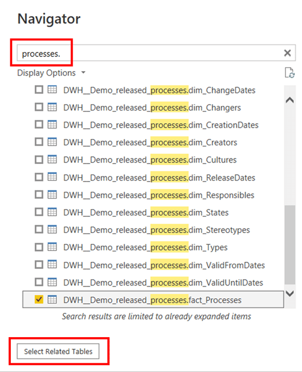
- In the Navigator, select all the tables you need to create your report and click Load . Only select the tables needed to keep your file clear. If you enter the name of the schema (for example processes ) into the search bar, only the tables of the regarding models are suggested. (Your access data is sent in the email containing the name of the SQL Schema.) There is an option to check just the main table (in this example: DWH_Demoreleasedprocesses.factProcesses ) of a model and auto-select all related tables of this model by using the Select Related Tables button.
If the connection is created, you will find all loaded tables in the Fields section of the right panel:
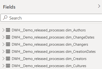
Navigation in Power BI
On the right side there are three areas with different types of tools to work with: Filter, Visualizations and Fields:

In addition, you will find two or three different panes in the Visualizations section. On the left there is the Fields pane, in the middle is the Format pane and on the right is the Analytics pane, which is only displayed if any visualization is selected.
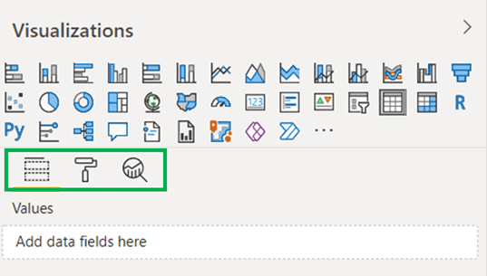
Add Visualization
To add a visualization to the report:
-
In the section
Visualizationson the right side you can choose between different kinds. If you hover over the icons, you can see the name of the diagrams in the tooltip. To understand how Power BI works, let's start with a simple visualization, for example select Table .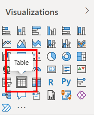
A blank table is added to your report. Next, you will populate it with data.
-
Select the new created table in the page on the left. On the right, change the
Visualizationssection to theFieldspane. You can select the data from theFieldssection on the right or drag the data field and drop it to the Values .
Use drag and drop to change the order of the fields. Depending on the chosen visualization there can be additional information where you need to add fields, such as for the legend.
- Repeat these steps for other visualizations.
Filter Data
To show only some but not all of the contained data, you can filter the data in the Filter section. In the following example there are two versions of each process, one in English and one in German. The different languages are filtered based on the CultureId column.
Filter Area You can apply the filter only on the current visualization, on the whole page or on all pages. If you filter by language it makes sense to filter on the whole page and not only on one visualization.
Drag the column you want to filter into the Filter section and choose "Basic filtering" as the Filter type.
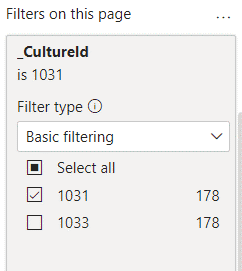
Filter types
Basic filtering: Selects the from available values.
Advanced filtering: Filter with operators and individual values.
Calculated Values
To display not only the values your tables provide you, but also the calculated values, you can create a measure with DAX.
Data Analysis Expressions (DAX) is a programming language that is used throughout Microsoft Power BI for creating calculated columns, measures, and custom tables. It is a collection of functions, operators, and constants that can be used in a formula, or expression, to calculate and return one or more values. You can use DAX to solve a number of calculations and data analysis problems, which can help you create new information from data that is already in your model. Detailed Tutorial
-
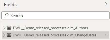
First select the data-table (in the
Fieldssection) to which the measure relates.
-
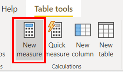
Click on
New Measure
in the
Table Toolstab on the top of the screen:
- An input appears on the top. Enter a name for the measure and use it in your DAX. Select an expressive name to indicate why the measure is there.

This example shows an easy calculation that counts the number of processes by counting the rows of the process-table:

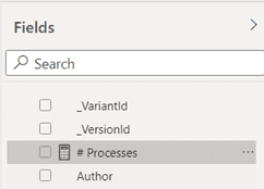
After creating the measure it is visible in the Fields section on the right:
-
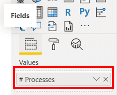
The measure field can be used the same way as the imported data fields. In this example you only want to display the calculated number of processes without a chart. Therefor choose the table-visualization and add the created measure in the
Fieldspane as a value:
After formatting the column header, the table looks like something like this:

Format Visualization
Next, you can format the visualizations to give the report an expressive look. There are nearly endless options to customize the look of visualizations. For an individual design you can change parameters as color, font or size. But some units as the title can also be hidden. In the following section you'll find an overview of the most important formatting options.
-
In order to change the format of a visualization select it in the page on the left and change to the
Formatpane in theVisualizationssection on the right.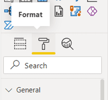
Visualization Designs
General: You can change the position and add a description.
Title: You can edit the style of the title, for example font color or alignment.
Background: You can choose the background color and transparency.
Border: You can add a border and edit its color and radius.
Data Color: For charts you can select the color of the of the displayed data.
Legend: For charts you can show or hide the legend and edit its style.
Column Headers: You can design the column headers of a table, for example the colors of font and background.
Grid: You can edit the grid of a table, for example you can change colors, text size or line weight.
X/Y Axis: You can change for example the scale type, color, text size or category width of an axis.
-
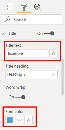
In the first example, add a title to the table and change its font color. Expand the
Titlecard and change the slider from off to on . Here you can add a title and change its color or size:
-
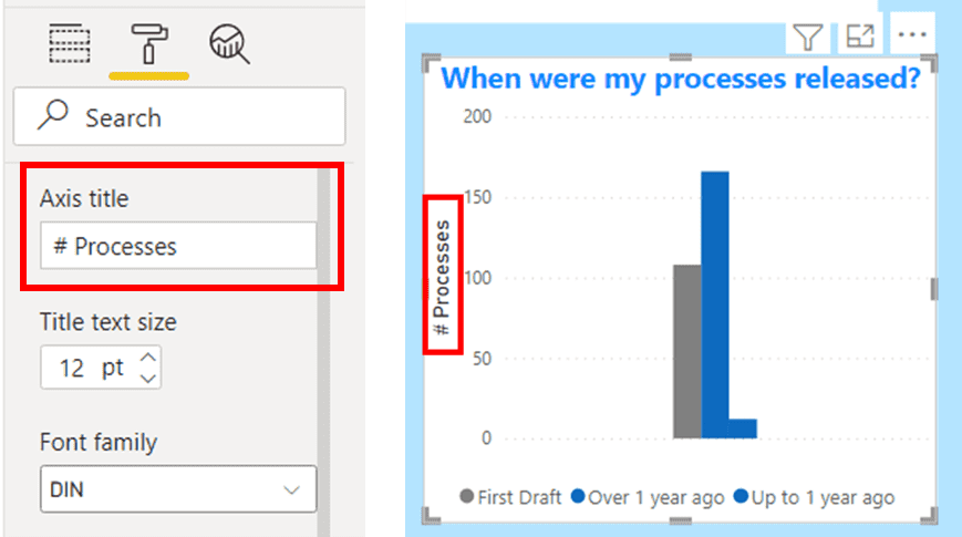
There are also more interesting kinds of visualizations: For example, if you’ve added a bar chart, you can edit the format of the legend or the axis in the
Formatpane:
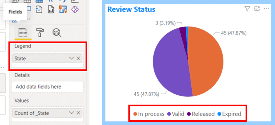
What data is shown in the legend, can be determined in the Fields pane. For example, you can show the state of a process in a pie chart:
Page Formatting
To refine the outlook of the report, you can change the formatting of the whole page.
-
If no visualization is selected, go to the
Formatpane, and expandPage Background. Here you can edit the color of the background or select a background picture.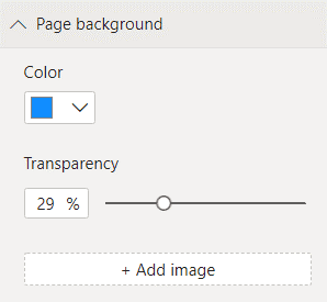
-
Go to the
Inserttab at the top to add elements such as text boxes or pictures.
For example, you can add a text box with a title or a logo of a company to the report:
